Animated charts with D3.js 🧑🎨
D3.js is the most famous data visualization library, and for good reason: it’s a cleverly designed collection of functions and methods that allow you to create fully customizable data visualizations on the Web as SVG images. It was created around 2011 by Mike Bostock and other computer scientists. More recently, Philippe Rivière became one of the main maintainers and contributors.
In a previous lesson, we used the Plot library for our visualizations. Under the hood, Plot uses… D3! And it’s mainly maintained by Bostock and Rivière! Surprise! 😁 Plot is so good that I find myself using it most of the time for my dataviz needs. But when I want to create something highly customized, especially with animations, D3 is still my go-to.
In this project, we will use earthquake data to create an animated scatterplot with D3 and Svelte, as shown below. I strongly suggest you complete the previous sections of the course before diving in. I won’t spend much time on setup, using the Simple Data Analysis library or the Svelte framework.

Setup
We will use setup-sda to set up and install everything we need.
Open a new folder with VS Code and run deno -A jsr:@nshiab/setup-sda --svelte.

Earthquake data
To retrieve earthquake data, I used the USGS Earthquake Catalog. Since 2021 appeared to be a very active year, I downloaded two CSV files for this year and pushed the files to GitHub.
Using the Simple Data Analysis library in the sda folder, we can easily retrieve and cache them. Update sda/main.ts, then run deno task sda to execute and watch it.
import { SimpleDB } from "@nshiab/simple-data-analysis";

const sdb = new SimpleDB();

const earthquakes = sdb.newTable("earthquakes");
await earthquakes.cache(async () => {
  await earthquakes.loadData([
    "https://raw.githubusercontent.com/nshiab/data-fetch-lesson/refs/heads/main/earthquakes-2021-1.csv",
    "https://raw.githubusercontent.com/nshiab/data-fetch-lesson/refs/heads/main/earthquakes-2021-2.csv",
  ]);
});

await earthquakes.logTable();

await sdb.done();
As you can see, there are over 28,000 earthquakes in our data and many columns. We can filter it and keep only what we’re interested in:
- We only want
earthquakein thetypecolumn andreviewedin thestatuscolumn. - We filter to keep only earthquakes that could cause damage, with a magnitude of 5 or more.
- We rename the
latitudeandlongitudecolumns to shorter names. - We keep only the
time,lat,lon,depth, andmagcolumns. - We round the numerical values to 3 decimals.
- Because it makes more sense, we make the
depthvalues negative. - And finally, we remove duplicates.
We end up with around 2,000 earthquakes.
import { SimpleDB } from "@nshiab/simple-data-analysis";

const sdb = new SimpleDB();

const earthquakes = sdb.newTable("earthquakes");
await earthquakes.cache(async () => {
  await earthquakes.loadData([
    "https://raw.githubusercontent.com/nshiab/data-fetch-lesson/refs/heads/main/earthquakes-2021-1.csv",
    "https://raw.githubusercontent.com/nshiab/data-fetch-lesson/refs/heads/main/earthquakes-2021-2.csv",
  ]);
});

await earthquakes.sort({ time: "asc" });
await earthquakes.keep({
  "type": "earthquake",
  "status": "reviewed",
});
await earthquakes.filter(`mag >= 5`);
await earthquakes.renameColumns({ latitude: "lat", longitude: "lon" });
await earthquakes.selectColumns([
  "time",
  "lat",
  "lon",
  "depth",
  "mag",
]);
await earthquakes.round(["lat", "lon", "depth", "mag"], {
  decimals: 3,
});
await earthquakes.updateColumn("depth", `depth * -1`);
await earthquakes.removeDuplicates();
await earthquakes.logTable();

await sdb.done();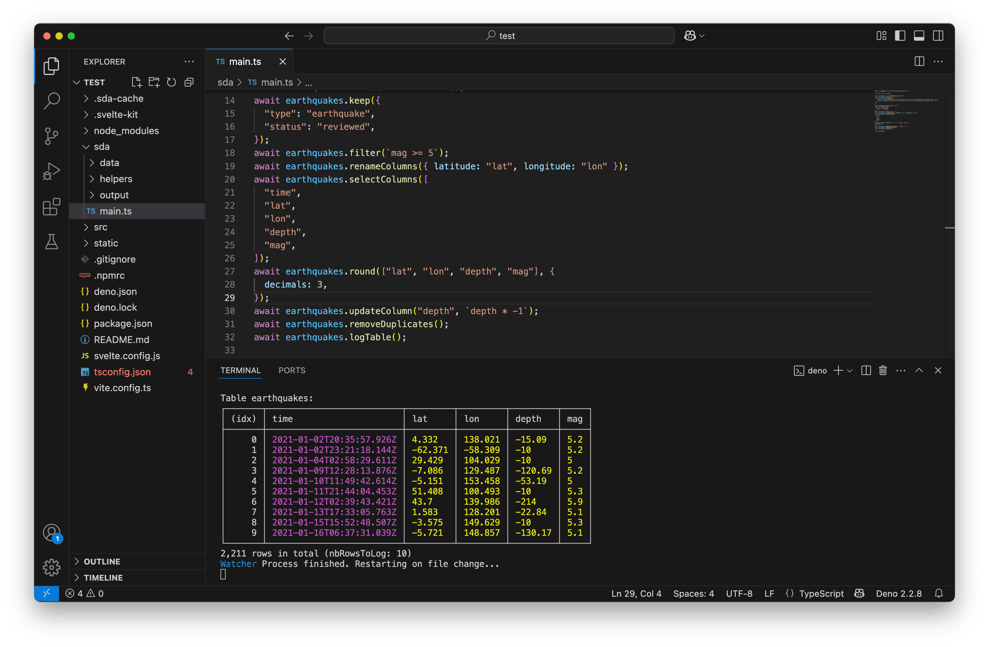
Exploratory dataviz
Before diving into customized data visualizations, it’s important to first explore the data a little bit. We can use the writeChart function with Plot to quickly draw a few charts and get a sense of what we’re working with:
sda/output/earthquakes-lat-lon.pngshows us where most earthquakes happen—along the earthquake faults. All coordinates seem correct.- With
sda/output/earthquakes-time-mag.png, we can clearly see the most powerful earthquakes. The three above magnitude 8 match the Wikipedia List of earthquakes in 2021. sda/output/earthquakes-mag-depth.pngsuggests that most earthquakes occur above a depth of 250 km. The four most powerful ones were actually close to the surface.
import { SimpleDB } from "@nshiab/simple-data-analysis";
import { dot, plot } from "@observablehq/plot";

const sdb = new SimpleDB();

const earthquakes = sdb.newTable("earthquakes");
await earthquakes.cache(async () => {
  await earthquakes.loadData([
    "https://raw.githubusercontent.com/nshiab/data-fetch-lesson/refs/heads/main/earthquakes-2021-1.csv",
    "https://raw.githubusercontent.com/nshiab/data-fetch-lesson/refs/heads/main/earthquakes-2021-2.csv",
  ]);
});

await earthquakes.sort({ time: "asc" });
await earthquakes.keep({
  "type": "earthquake",
  "status": "reviewed",
});
await earthquakes.filter(`mag >= 5`);
await earthquakes.renameColumns({ latitude: "lat", longitude: "lon" });
await earthquakes.selectColumns([
  "time",
  "lat",
  "lon",
  "depth",
  "mag",
]);
await earthquakes.round(["lat", "lon", "depth", "mag"], {
  decimals: 3,
});
await earthquakes.updateColumn("depth", `depth * -1`);
await earthquakes.removeDuplicates();
await earthquakes.logTable();
await earthquakes.writeChart(
  (data) =>
    plot({
      marks: [
        dot(data, {
          x: "lon",
          y: "lat",
        }),
      ],
    }),
  "sda/output/earthquakes-lat-lon.png",
);
await earthquakes.writeChart(
  (data) =>
    plot({
      marks: [
        dot(data, {
          x: "time",
          y: "mag",
        }),
      ],
    }),
  "sda/output/earthquakes-time-mag.png",
);
await earthquakes.writeChart(
  (data) =>
    plot({
      y: { labelArrow: "down" },
      marks: [
        dot(data, {
          x: "mag",
          y: "depth",
        }),
      ],
    }),
  "sda/output/earthquakes-mag-depth.png",
);

await sdb.done();
To open two tabs one on top of the other, right-click on the tab you want at the bottom and click on Split down. You can also Split left, Split right, or Split top. You can also drag and drop a tab to another screen, if you have more than one.
Writing data for the web
Since our data looks good, we can now write it to a JSON file that Svelte—and any web browser—will be able to handle. We just need to add one line with the writeData method and make sure to write the file to the src folder (instead of sda, where we’ve been working so far).
If you remember the previous lessons, writeData creates an array of objects. This is exactly what D3 needs. 😉
Note that JSON files can’t store Date objects, so our dates have been serialized. They are saved as strings following the ISO 8601 format. They’ll be easy to convert back to dates.
import { SimpleDB } from "@nshiab/simple-data-analysis";
import { dot, plot } from "@observablehq/plot";

const sdb = new SimpleDB();

const earthquakes = sdb.newTable("earthquakes");
await earthquakes.cache(async () => {
  await earthquakes.loadData([
    "https://raw.githubusercontent.com/nshiab/data-fetch-lesson/refs/heads/main/earthquakes-2021-1.csv",
    "https://raw.githubusercontent.com/nshiab/data-fetch-lesson/refs/heads/main/earthquakes-2021-2.csv",
  ]);
});

await earthquakes.sort({ time: "asc" });
await earthquakes.keep({
  "type": "earthquake",
  "status": "reviewed",
});
await earthquakes.filter(`mag >= 5`);
await earthquakes.renameColumns({ latitude: "lat", longitude: "lon" });
await earthquakes.selectColumns([
  "time",
  "lat",
  "lon",
  "depth",
  "mag",
]);
await earthquakes.round(["lat", "lon", "depth", "mag"], {
  decimals: 3,
});
await earthquakes.updateColumn("depth", `depth * -1`);
await earthquakes.removeDuplicates();
await earthquakes.logTable();
await earthquakes.writeChart(
  (data) =>
    plot({
      marks: [
        dot(data, {
          x: "lon",
          y: "lat",
        }),
      ],
    }),
  "sda/output/earthquakes-lat-lon.png",
);
await earthquakes.writeChart(
  (data) =>
    plot({
      marks: [
        dot(data, {
          x: "time",
          y: "mag",
        }),
      ],
    }),
  "sda/output/earthquakes-time-mag.png",
);
await earthquakes.writeChart(
  (data) =>
    plot({
      y: { labelArrow: "down" },
      marks: [
        dot(data, {
          x: "mag",
          y: "depth",
        }),
      ],
    }),
  "sda/output/earthquakes-mag-depth.png",
);
await earthquakes.writeData("src/data/earthquakes.json");

await sdb.done();
Chart component
Let’s set up a new Svelte component with a helper function for our scatter plot.
But before we do, it’s always helpful to define some types that we’ll use repeatedly. In src/lib/index.ts, we can place types and variables that will be easily accessible throughout our Svelte project.
We can create earthquake and variable types, and export them. They’ll be very handy going forward.
type earthquake = {
  time: Date;
  lat: number;
  lon: number;
  depth: number;
  mag: number;
};

type variable = keyof earthquake;

export type { earthquake, variable };
Now let’s create the helper function drawChart.ts in the src/helpers folder (again, not sda). It’s where our D3 code will live. This function will need a few things:
- An
id, which will be theidof thesvgelement in which we will draw our chart. More aboutsvgbelow. - The
earthquakesdata. - The
x,y, andr(radius of our dots) variables. - The
widthandheightof the chart.
For now, let’s just log the parameters.
Note that since we used src/lib/index.ts, we can easily import our types (and anything else we want in it) with from $lib. It’s a handy shortcut!
import type { earthquake, variable } from "$lib";

export default function drawChart(
  id: string,
  earthquakes: earthquake[],
  x: variable,
  y: variable,
  r: variable,
  width: number,
  height: number,
) {
  console.log({ id, earthquakes, x, y, r, width, height });
}
We can now create a new Chart.svelte component that:
- Imports our
earthquakes.jsondata asearthquakesRaw(line 3), and maps over it to convert thetimevalues back toDateobjects (lines 13–16). - Retrieves the
id,x,y, andrasprops(lines 6–11). - Creates
widthandheightstates (lines 18–19) and binds them to theclientWidthandclientHeightof thesvgelement in which we will draw our chart (line 26). We’ll talk more aboutsvgelements later on. - Uses the
$effectrune to calldrawChartwith all the props and states. This means Svelte will recalldrawChartif any of the arguments change, includingwidthandheight, making the chart responsive. - Sets a
margin-top,width, andheightfor thesvginside thestyletags.
<script lang="ts">
import type { variable } from "$lib";
import earthquakesRaw from "../data/earthquakes.json";
import drawChart from "../helpers/drawChart";
const { id, x, y, r }: {
id: string;
x: variable;
y: variable;
r: variable
} = $props();
const earthquakes = earthquakesRaw.map((d) => ({
...d,
time: new Date(d.time),
}));
let width = $state(0);
let height = $state(0);
$effect(() => {
drawChart(id, earthquakes, x, y, r, width, height);
});
</script>
<svg {id} bind:clientWidth={width} bind:clientHeight={height}></svg>
<style>
svg {
margin-top: 2rem;
width: 100%;
height: 400px;
}
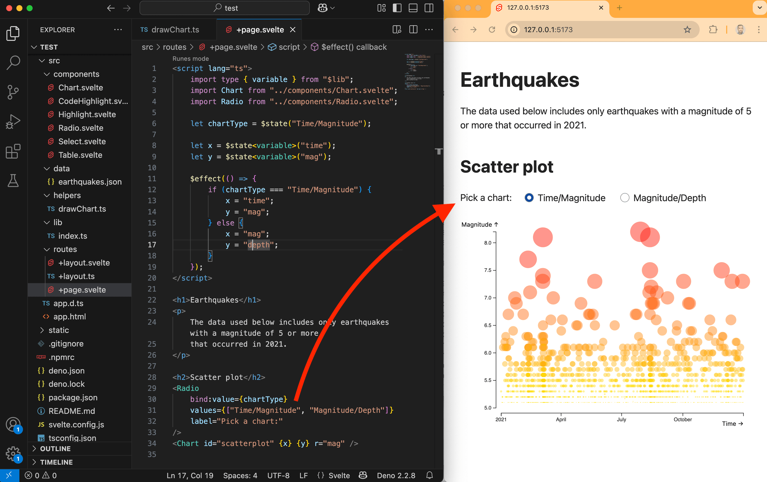
</style>And finally, we can import our new <Chart /> component on our page, which is src/routes/+page.svelte. We set the appropriate id, x, y, and r props. To start, let’s draw a chart of earthquakes and their magnitude over time. While we’re at it, we can add titles and a bit of text.
If you were still watching sda/main.ts, you can stop it (CTRL + C) and run deno task dev instead to start a local server. Open the URL provided in your terminal in your favorite web browser.
In your web browser’s console, you should see the log from drawChart.ts. We’re ready to code our chart!
<script lang="ts">
    import Chart from "../components/Chart.svelte";
</script>

<h1>Earthquakes</h1>
<p>
    The data used below includes only earthquakes with a magnitude of 5 or more
    that occurred in 2021.
</p>

<h2>Scatter plot</h2>
<Chart id="scatterplot" x="time" y="mag" r="mag" />
Drawing with D3
All of this setup might seem complicated… but there’s actually a lot of value in compartmentalizing your code. When each file is focused on doing one thing, it’s easier to debug. There’s less repetition in your codebase. Also, small pieces of code doing just a few things are easier to rework than one big file doing everything. This will become especially clear when we add animations.
But we’ve waited long enough—let’s play with D3 now!
Stop your local server (CTRL + C) and install D3 with deno add npm:d3. Then rerun your local server with deno task dev.
Let’s start slowly by drawing one big blue circle in our svg with our drawChart function. In the code below, D3:
- Selects the
svgelement with the givenid. - Appends a
circleto thesvg. - Specifies several attributes for the circle by chaining methods.
cxandcyare the coordinates of the center of the circle. We place it at the center of thesvgusingwidth / 2andheight / 2.ris the circle’s radius—here, it’s 50 pixels.fillis the color inside the circle—here, it’s blue.
import type { earthquake, variable } from "$lib";
import { select } from "d3";

export default function drawChart(
  id: string,
  earthquakes: earthquake[],
  x: variable,
  y: variable,
  r: variable,
  width: number,
  height: number,
) {
  const svg = select(`#${id}`);

  svg.append("circle")
    .attr("cx", width / 2)
    .attr("cy", height / 2)
    .attr("r", 50)
    .attr("fill", "blue");
}
If you right-click on your blue circle and inspect it in your browser, you’ll see your svg with the circle added to the code of your page. This is how you draw SVG elements with D3: by telling it exactly what you want and where.

Now, this isn’t tied to any data. And we have more than two thousand earthquakes. How can we plot all of them?
First, we need scales to convert the earthquake values into pixels, radii, and colors. D3 scales (there are a lot of them) need two things: a domain and a range.
For example, in the code below, we use the extent function to retrieve the minimum and maximum of the x values. This function returns an array like [min, max]. Just in case you don’t remember, x is set to time in src/routes/+page.svelte.
Then we create a scaleTime (since x contains dates) with:
- the min and max time values as the domain
[0, width]as the range
Now, the scale can map Date objects to pixel values. Instead of width / 2 for cx, we can now use a date in 2021! xScale will automatically convert it to the appropriate pixel value.
import type { earthquake, variable } from "$lib";
import { extent, scaleTime, select } from "d3";

export default function drawChart(
  id: string,
  earthquakes: earthquake[],
  x: variable,
  y: variable,
  r: variable,
  width: number,
  height: number,
) {
  const svg = select(`#${id}`);

  const xDomain = extent(earthquakes, (d: earthquake) => d[x]);
  const xScale = scaleTime().domain(xDomain).range([0, width]);

  svg.append("circle")
    .attr("cx", xScale(new Date("2021-06-01T00:00:00Z")))
    .attr("cy", height / 2)
    .attr("r", 50)
    .attr("fill", "blue");
}
We can do the same thing for y (which is set to mag right now) and cy using a scaleLinear.
Again, change the magnitude value in line 23 to see the yScale in action. Remember that magnitudes in our data range from 5 to 8.
import type { earthquake, variable } from "$lib";
import { extent, scaleLinear, scaleTime, select } from "d3";

export default function drawChart(
  id: string,
  earthquakes: earthquake[],
  x: variable,
  y: variable,
  r: variable,
  width: number,
  height: number,
) {
  const svg = select(`#${id}`);

  const xDomain = extent(earthquakes, (d: earthquake) => d[x]);
  const xScale = scaleTime().domain(xDomain).range([0, width]);

  const yDomain = extent(earthquakes, (d: earthquake) => d[y]);
  const yScale = scaleLinear().domain(yDomain).range([height, 0]);

  svg.append("circle")
    .attr("cx", xScale(new Date("2021-06-01T00:00:00Z")))
    .attr("cy", yScale(7))
    .attr("r", 50)
    .attr("fill", "blue");
}
We can also add a scale for the r attribute—this time using a square root scale (scaleSqrt) because we want the area of the circle to be proportional to the data.
And let’s add another scale for the color, which could also be tied to the rDomain.
Yes, I know—D3 scales are amazing! And since they’re just functions, you can use them for anything you want, D3 charts or not!
import type { earthquake, variable } from "$lib";
import { extent, scaleLinear, scaleSqrt, scaleTime, select } from "d3";

export default function drawChart(
  id: string,
  earthquakes: earthquake[],
  x: variable,
  y: variable,
  r: variable,
  width: number,
  height: number,
) {
  const svg = select(`#${id}`);

  const xDomain = extent(earthquakes, (d: earthquake) => d[x]);
  const xScale = scaleTime().domain(xDomain).range([0, width]);

  const yDomain = extent(earthquakes, (d: earthquake) => d[y]);
  const yScale = scaleLinear().domain(yDomain).range([height, 0]);

  const rDomain = extent(earthquakes, (d: earthquake) => d[r]);
  const rScale = scaleSqrt().domain(rDomain).range([0, 20]);
  const fillScale = scaleLinear().domain(rDomain).range(["yellow", "red"]);

  svg.append("circle")
    .attr("cx", xScale(new Date("2021-06-01T00:00:00Z")))
    .attr("cy", yScale(7))
    .attr("r", rScale(7))
    .attr("fill", fillScale(7));
}
Now that we have scales, we can harness D3 to its fullest! Instead of appending just one circle, let’s bind SVG elements to our data.
Here’s a step-by-step explanation of the new code below:
- First, we select all circles in the SVG (line 25). On the first render, there are none—and that’s okay.
- Then we bind the data (line 26). Here, we have over 2,000 earthquakes. So this tells D3: “Hey, I’m going to ask you to draw something 2,000+ times.”
- We join the data to SVG elements (line 27). For each earthquake, we will draw a
circle. - Now we can use functions to tell D3 what attributes we want for each earthquake. Here, we’re using
x,y, andrwith the appropriate scales.
Since we have overlapping earthquakes, I’ve also set the opacity to 0.5.
import type { earthquake, variable } from "$lib";
import { extent, scaleLinear, scaleSqrt, scaleTime, select } from "d3";

export default function drawChart(
  id: string,
  earthquakes: earthquake[],
  x: variable,
  y: variable,
  r: variable,
  width: number,
  height: number,
) {
  const svg = select(`#${id}`);

  const xDomain = extent(earthquakes, (d: earthquake) => d[x]);
  const xScale = scaleTime().domain(xDomain).range([0, width]);

  const yDomain = extent(earthquakes, (d: earthquake) => d[y]);
  const yScale = scaleLinear().domain(yDomain).range([height, 0]);

  const rDomain = extent(earthquakes, (d: earthquake) => d[r]);
  const rScale = scaleSqrt().domain(rDomain).range([0, 20]);
  const fillScale = scaleLinear().domain(rDomain).range(["yellow", "red"]);

  svg.selectAll("circle")
    .data(earthquakes)
    .join("circle")
    .attr("cx", (d: earthquake) => xScale(d[x]))
    .attr("cy", (d: earthquake) => yScale(d[y]))
    .attr("r", (d: earthquake) => rScale(d[r]))
    .attr("fill", (d: earthquake) => fillScale(d[r]))
    .attr("opacity", 0.5);
}
And look at that! You now have all of your earthquakes added to your svg! And if you inspect a circle and check its Properties, you’ll see the earthquake data. It’s really bound to the SVG element.

Axis
We drew our earthquakes, but it would be great to add x and y axes. To make sure we have enough room for them, we also need margins.
Let’s create a margins object to add space around our chart and to translate our axes to the right positions.
To actually draw axes, we can use the axisLeft and axisBottom functions with our scales. We usually place them in a g element (which stands for group) to easily identify or move them with a class or id, if needed.
D3 axes are quite clever and will try to automatically create tick labels that make sense. Here, since we used a scaleTime for the axisBottom, and its domain is limited to 2021, the function shows 2021 at the start and then just months. However, to avoid overlapping labels, I set the number of ticks to 3.
Also, to avoid redrawing the axes over and over again when a prop or state changes (like when resizing the window), I gave them a class called axis and used it to select and remove them before drawing them again (line 55). Note that we don’t need to do that for the circles because they are binded to their data, even between renders.
import type { earthquake, variable } from "$lib";
import {
  axisBottom,
  axisLeft,
  extent,
  scaleLinear,
  scaleSqrt,
  scaleTime,
  select,
} from "d3";

export default function drawChart(
  id: string,
  earthquakes: earthquake[],
  x: variable,
  y: variable,
  r: variable,
  width: number,
  height: number,
) {
  const svg = select(`#${id}`);

  const margins = {
    top: 20,
    right: 20,
    bottom: 35,
    left: 80,
  };

  const xDomain = extent(earthquakes, (d: earthquake) => d[x]);
  const xScale = scaleTime().domain(xDomain).range([
    margins.left,
    width - margins.right,
  ]);

  const yDomain = extent(earthquakes, (d: earthquake) => d[y]);
  const yScale = scaleLinear().domain(yDomain).range([
    height - margins.bottom,
    margins.top,
  ]);

  const rDomain = extent(earthquakes, (d: earthquake) => d[r]);
  const rScale = scaleSqrt().domain(rDomain).range([0, 20]);
  const fillScale = scaleLinear().domain(rDomain).range(["yellow", "red"]);

  svg.selectAll("circle")
    .data(earthquakes)
    .join("circle")
    .attr("cx", (d: earthquake) => xScale(d[x]))
    .attr("cy", (d: earthquake) => yScale(d[y]))
    .attr("r", (d: earthquake) => rScale(d[r]))
    .attr("fill", (d: earthquake) => fillScale(d[r]))
    .attr("opacity", 0.5);

  svg.selectAll(".axis").remove();

  svg
    .append("g")
    .attr("class", "axis")
    .attr(
      "transform",
      `translate(0, ${height - margins.bottom})`,
    )
    .call(axisBottom(xScale).ticks(3));

  svg
    .append("g")
    .attr("class", "axis")
    .attr("transform", `translate(${margins.left}, 0)`)
    .call(axisLeft(yScale));
}
Finally, it would be great to add labels to the axes too—and maybe some insets to prevent circles from overlapping with the axes.
To have proper labels instead of the abbreviations used in our data, I created a labels object that we can use for the text.
import type { earthquake, variable } from "$lib";
import {
  axisBottom,
  axisLeft,
  extent,
  scaleLinear,
  scaleSqrt,
  scaleTime,
  select,
} from "d3";

export default function drawChart(
  id: string,
  earthquakes: earthquake[],
  x: variable,
  y: variable,
  r: variable,
  width: number,
  height: number,
) {
  const svg = select(`#${id}`);

  const margins = {
    top: 20,
    right: 20,
    bottom: 35,
    left: 80,
  };
  const inset = 10;

  const xDomain = extent(earthquakes, (d: earthquake) => d[x]);
  const xScale = scaleTime().domain(xDomain).range([
    margins.left,
    width - margins.right,
  ]);

  const yDomain = extent(earthquakes, (d: earthquake) => d[y]);
  const yScale = scaleLinear().domain(yDomain).range([
    height - margins.bottom,
    margins.top,
  ]);

  const rDomain = extent(earthquakes, (d: earthquake) => d[r]);
  const rScale = scaleSqrt().domain(rDomain).range([0, 20]);
  const fillScale = scaleLinear().domain(rDomain).range(["yellow", "red"]);

  svg.selectAll("circle")
    .data(earthquakes)
    .join("circle")
    .attr("cx", (d: earthquake) => xScale(d[x]))
    .attr("cy", (d: earthquake) => yScale(d[y]))
    .attr("r", (d: earthquake) => rScale(d[r]))
    .attr("fill", (d: earthquake) => fillScale(d[r]))
    .attr("opacity", 0.5);

  svg.selectAll(".axis").remove();

  svg
    .append("g")
    .attr("class", "axis")
    .attr(
      "transform",
      `translate(0, ${height - margins.bottom + inset})`,
    )
    .call(axisBottom(xScale).ticks(3));

  svg
    .append("g")
    .attr("class", "axis")
    .attr("transform", `translate(${margins.left - inset}, 0)`)
    .call(axisLeft(yScale));

  svg.selectAll(".labels").remove();

  const labels: { [key: string]: string } = {
    "time": "Time",
    "mag": "Magnitude",
  };

  svg.append("text")
    .attr("class", "labels")
    .attr("x", width - margins.right)
    .attr("y", height)
    .attr("font-size", 12)
    .attr("text-anchor", "end")
    .text(`${labels[x]} →`);

  svg.append("text")
    .attr("class", "labels")
    .attr("x", margins.left - inset / 2)
    .attr("y", margins.top - inset)
    .attr("font-size", 12)
    .attr("text-anchor", "end")
    .text(`${labels[y]} ↑`);
}
This is looking quite good for a first D3 chart! And it’s fully responsive! Try resizing your web browser and see the magic happen!

Animations
Our chart is great, but let’s be honest: we could create the same thing much faster and more easily with Plot…
However, there’s one thing that Plot can’t do easily: animations.
Let’s update our src/routes/+page.svelte to give the user two chart options. We can use the pre-coded <Radio /> components, which create radio buttons, and we can bind the chartType to the selected option.
Depending on the chartType state, we can update the newly created x and y states, which are then passed to our <Chart /> component.
<script lang="ts">
    import type { variable } from "$lib";
    import Chart from "../components/Chart.svelte";
    import Radio from "../components/Radio.svelte";

    let chartType = $state("Time/Magnitude");

    let x = $state<variable>("time");
    let y = $state<variable>("mag");

    $effect(() => {
        if (chartType === "Time/Magnitude") {
            x = "time";
            y = "mag";
        } else {
            x = "mag";
            y = "depth";
        }
    });
</script>

<h1>Earthquakes</h1>
<p>
    The data used below includes only earthquakes with a magnitude of 5 or more
    that occurred in 2021.
</p>

<h2>Scatter plot</h2>
<Radio
    bind:value={chartType}
    values={["Time/Magnitude", "Magnitude/Depth"]}
    label="Pick a chart:"
/>
<Chart id="scatterplot" {x} {y} r="mag" />You might be wondering what the <variable> is on lines 8 and 9. Just as you can pass arguments to some functions, you can also pass types. This is the syntax for it. Here, it tells $state that the state it will create should be of type variable.
Now, each time we switch the chart type, our <Chart /> component gets re-rendered with new x and y values, which are used by our drawChart function!
There are a few visual bugs that we can fix right away in src/helpers/drawChart.ts:
- If
xistime, we should use ascaleTime, but if it’smag, we should usescaleLinear. - If
xistime, we can stick with 3 ticks, but if it’smag, we can let D3 decide. - We can add
Depthto ourlabelsobject and change the direction of the y-axis arrow if it’sdepth. - We can tweak
marginsand the label positions to avoid cutting off our new text.
import type { earthquake, variable } from "$lib";
import {
  axisBottom,
  axisLeft,
  extent,
  scaleLinear,
  scaleSqrt,
  scaleTime,
  select,
} from "d3";

export default function drawChart(
  id: string,
  earthquakes: earthquake[],
  x: variable,
  y: variable,
  r: variable,
  width: number,
  height: number,
) {
  const svg = select(`#${id}`);

  const margins = {
    top: 20,
    right: 20,
    bottom: 45,
    left: 85,
  };
  const inset = 10;

  const xDomain = extent(earthquakes, (d: earthquake) => d[x]);
  const xRange = [
    margins.left,
    width - margins.right,
  ];
  const xScale = x === "time"
    ? scaleTime().domain(xDomain).range(xRange)
    : scaleLinear().domain(xDomain).range(xRange);

  const yDomain = extent(earthquakes, (d: earthquake) => d[y]);
  const yScale = scaleLinear().domain(yDomain).range([
    height - margins.bottom,
    margins.top,
  ]);

  const rDomain = extent(earthquakes, (d: earthquake) => d[r]);
  const rScale = scaleSqrt().domain(rDomain).range([0, 20]);
  const fillScale = scaleLinear().domain(rDomain).range(["yellow", "red"]);

  svg.selectAll("circle")
    .data(earthquakes)
    .join("circle")
    .attr("cx", (d: earthquake) => xScale(d[x]))
    .attr("cy", (d: earthquake) => yScale(d[y]))
    .attr("r", (d: earthquake) => rScale(d[r]))
    .attr("fill", (d: earthquake) => fillScale(d[r]))
    .attr("opacity", 0.5);

  svg.selectAll(".axis").remove();

  svg
    .append("g")
    .attr("class", "axis")
    .attr(
      "transform",
      `translate(0, ${height - margins.bottom + inset})`,
    )
    .call(x === "time" ? axisBottom(xScale).ticks(3) : axisBottom(xScale));

  svg
    .append("g")
    .attr("class", "axis")
    .attr("transform", `translate(${margins.left - inset}, 0)`)
    .call(axisLeft(yScale));

  svg.selectAll(".labels").remove();

  const labels: { [key: string]: string } = {
    "time": "Time",
    "mag": "Magnitude",
    "depth": "Depth (km)",
  };

  svg.append("text")
    .attr("class", "labels")
    .attr("x", width - margins.right)
    .attr("y", height - 3)
    .attr("font-size", 12)
    .attr("text-anchor", "end")
    .text(`${labels[x]} →`);

  svg.append("text")
    .attr("class", "labels")
    .attr("x", margins.left - inset / 2)
    .attr("y", margins.top - inset)
    .attr("font-size", 12)
    .attr("text-anchor", "end")
    .text(y === "depth" ? `${labels[y]} ↓` : `${labels[y]} ↑`);
}
This is cool, but it’s not animated. The chart just keeps getting redrawn without any transitions. Let’s rework src/helpers/drawChart.ts to create a smooth transition for the circles.
Creating animations with D3 is very easy. You first need to select the elements you want, call .transition(), and then chain the attributes you want to change.
In our case, we first need to check whether we need to draw or animate. To do that, we check if there’s anything already in our svg (line 23). If there’s nothing, it means we need to draw (lines 53–60). Otherwise, we want to animate the elements that are already there (lines 62–65).
To animate, we select all the circles, call .transition() to tell D3 to interpolate between their current attributes and the new ones. Here, we just update cx and cy using the updated domain and range from xScale and yScale.
Easy!
import type { earthquake, variable } from "$lib";
import {
  axisBottom,
  axisLeft,
  extent,
  scaleLinear,
  scaleSqrt,
  scaleTime,
  select,
} from "d3";

export default function drawChart(
  id: string,
  earthquakes: earthquake[],
  x: variable,
  y: variable,
  r: variable,
  width: number,
  height: number,
) {
  const svg = select(`#${id}`);

  const animate = svg.selectAll("*").nodes().length > 0;

  const margins = {
    top: 20,
    right: 20,
    bottom: 45,
    left: 85,
  };
  const inset = 10;

  const xDomain = extent(earthquakes, (d: earthquake) => d[x]);
  const xRange = [
    margins.left,
    width - margins.right,
  ];
  const xScale = x === "time"
    ? scaleTime().domain(xDomain).range(xRange)
    : scaleLinear().domain(xDomain).range(xRange);

  const yDomain = extent(earthquakes, (d: earthquake) => d[y]);
  const yScale = scaleLinear().domain(yDomain).range([
    height - margins.bottom,
    margins.top,
  ]);

  const rDomain = extent(earthquakes, (d: earthquake) => d[r]);
  const rScale = scaleSqrt().domain(rDomain).range([0, 20]);
  const fillScale = scaleLinear().domain(rDomain).range(["yellow", "red"]);

  if (!animate) {
    svg.selectAll("circle")
      .data(earthquakes)
      .join("circle")
      .attr("cx", (d: earthquake) => xScale(d[x]))
      .attr("cy", (d: earthquake) => yScale(d[y]))
      .attr("r", (d: earthquake) => rScale(d[r]))
      .attr("fill", (d: earthquake) => fillScale(d[r]))
      .attr("opacity", 0.5);
  } else {
    svg.selectAll("circle")
      .transition()
      .attr("cx", (d: earthquake) => xScale(d[x]))
      .attr("cy", (d: earthquake) => yScale(d[y]));
  }

  svg.selectAll(".axis").remove();

  svg
    .append("g")
    .attr("class", "axis")
    .attr(
      "transform",
      `translate(0, ${height - margins.bottom + inset})`,
    )
    .call(x === "time" ? axisBottom(xScale).ticks(3) : axisBottom(xScale));

  svg
    .append("g")
    .attr("class", "axis")
    .attr("transform", `translate(${margins.left - inset}, 0)`)
    .call(axisLeft(yScale));

  svg.selectAll(".labels").remove();

  const labels: { [key: string]: string } = {
    "time": "Time",
    "mag": "Magnitude",
    "depth": "Depth (km)",
  };

  svg.append("text")
    .attr("class", "labels")
    .attr("x", width - margins.right)
    .attr("y", height - 3)
    .attr("font-size", 12)
    .attr("text-anchor", "end")
    .text(`${labels[x]} →`);

  svg.append("text")
    .attr("class", "labels")
    .attr("x", margins.left - inset / 2)
    .attr("y", margins.top - inset)
    .attr("font-size", 12)
    .attr("text-anchor", "end")
    .text(y === "depth" ? `${labels[y]} ↓` : `${labels[y]} ↑`);
}
But if you test the animation right now, it’s not very interesting. It’s too fast, and all the dots move at the same time. We can fancy that up by passing a duration, an ease, and a delay.

For the duration, I picked 1,000 milliseconds. For the easing, I like easeCubicInOut, but you have lots of options with D3. And for the delay, I’m just using the duration multiplied by a random number between 0 and 1. So each dot will have a different delay—between 0 and the full duration.
Now, this feels more organic and enjoyable to watch!
import type { earthquake, variable } from "$lib";
import {
  axisBottom,
  axisLeft,
  easeCubicInOut,
  extent,
  scaleLinear,
  scaleSqrt,
  scaleTime,
  select,
} from "d3";

export default function drawChart(
  id: string,
  earthquakes: earthquake[],
  x: variable,
  y: variable,
  r: variable,
  width: number,
  height: number,
) {
  const svg = select(`#${id}`);

  const animate = svg.selectAll("*").nodes().length > 0;
  const duration = 1000;

  const margins = {
    top: 20,
    right: 20,
    bottom: 45,
    left: 85,
  };
  const inset = 10;

  const xDomain = extent(earthquakes, (d: earthquake) => d[x]);
  const xRange = [
    margins.left,
    width - margins.right,
  ];
  const xScale = x === "time"
    ? scaleTime().domain(xDomain).range(xRange)
    : scaleLinear().domain(xDomain).range(xRange);

  const yDomain = extent(earthquakes, (d: earthquake) => d[y]);
  const yScale = scaleLinear().domain(yDomain).range([
    height - margins.bottom,
    margins.top,
  ]);

  const rDomain = extent(earthquakes, (d: earthquake) => d[r]);
  const rScale = scaleSqrt().domain(rDomain).range([0, 20]);
  const fillScale = scaleLinear().domain(rDomain).range(["yellow", "red"]);

  if (!animate) {
    svg.selectAll("circle")
      .data(earthquakes)
      .join("circle")
      .attr("cx", (d: earthquake) => xScale(d[x]))
      .attr("cy", (d: earthquake) => yScale(d[y]))
      .attr("r", (d: earthquake) => rScale(d[r]))
      .attr("fill", (d: earthquake) => fillScale(d[r]))
      .attr("opacity", 0.5);
  } else {
    svg.selectAll("circle")
      .transition()
      .duration(duration)
      .ease(easeCubicInOut)
      .delay(() => Math.random() * duration)
      .attr("cx", (d: earthquake) => xScale(d[x]))
      .attr("cy", (d: earthquake) => yScale(d[y]));
  }

  svg.selectAll(".axis").remove();

  svg
    .append("g")
    .attr("class", "axis")
    .attr(
      "transform",
      `translate(0, ${height - margins.bottom + inset})`,
    )
    .call(x === "time" ? axisBottom(xScale).ticks(3) : axisBottom(xScale));

  svg
    .append("g")
    .attr("class", "axis")
    .attr("transform", `translate(${margins.left - inset}, 0)`)
    .call(axisLeft(yScale));

  svg.selectAll(".labels").remove();

  const labels: { [key: string]: string } = {
    "time": "Time",
    "mag": "Magnitude",
    "depth": "Depth (km)",
  };

  svg.append("text")
    .attr("class", "labels")
    .attr("x", width - margins.right)
    .attr("y", height - 3)
    .attr("font-size", 12)
    .attr("text-anchor", "end")
    .text(`${labels[x]} →`);

  svg.append("text")
    .attr("class", "labels")
    .attr("x", margins.left - inset / 2)
    .attr("y", margins.top - inset)
    .attr("font-size", 12)
    .attr("text-anchor", "end")
    .text(y === "depth" ? `${labels[y]} ↓` : `${labels[y]} ↑`);
}
We could also animate the axes and labels.
For the x-axis, since it’s updating from dates to numbers and vice versa, there’s no smooth way to transition the values like we do with the y-axis. So instead, I chained transitions to make it fade out, update, and then fade back in. It’s the same trick for the text labels.
Also, note that we no longer need to remove the axes or labels, since we’re now updating them directly.
import type { earthquake, variable } from "$lib";
import {
  axisBottom,
  axisLeft,
  easeCubicInOut,
  extent,
  scaleLinear,
  scaleSqrt,
  scaleTime,
  select,
} from "d3";

export default function drawChart(
  id: string,
  earthquakes: earthquake[],
  x: variable,
  y: variable,
  r: variable,
  width: number,
  height: number,
) {
  const svg = select(`#${id}`);

  const animate = svg.selectAll("*").nodes().length > 0;
  const duration = 1000;

  const margins = {
    top: 20,
    right: 20,
    bottom: 45,
    left: 85,
  };
  const inset = 10;

  const xDomain = extent(earthquakes, (d: earthquake) => d[x]);
  const xRange = [
    margins.left,
    width - margins.right,
  ];
  const xScale = x === "time"
    ? scaleTime().domain(xDomain).range(xRange)
    : scaleLinear().domain(xDomain).range(xRange);

  const yDomain = extent(earthquakes, (d: earthquake) => d[y]);
  const yScale = scaleLinear().domain(yDomain).range([
    height - margins.bottom,
    margins.top,
  ]);

  const rDomain = extent(earthquakes, (d: earthquake) => d[r]);
  const rScale = scaleSqrt().domain(rDomain).range([0, 20]);
  const fillScale = scaleLinear().domain(rDomain).range(["yellow", "red"]);

  if (!animate) {
    svg.selectAll("circle")
      .data(earthquakes)
      .join("circle")
      .attr("cx", (d: earthquake) => xScale(d[x]))
      .attr("cy", (d: earthquake) => yScale(d[y]))
      .attr("r", (d: earthquake) => rScale(d[r]))
      .attr("fill", (d: earthquake) => fillScale(d[r]))
      .attr("opacity", 0.5);
  } else {
    svg.selectAll("circle")
      .transition()
      .duration(duration)
      .ease(easeCubicInOut)
      .delay(() => Math.random() * duration)
      .attr("cx", (d: earthquake) => xScale(d[x]))
      .attr("cy", (d: earthquake) => yScale(d[y]));
  }

  if (!animate) {
    svg
      .append("g")
      .attr("id", "x-axis")
      .attr(
        "transform",
        `translate(0, ${height - margins.bottom + inset})`,
      )
      .call(x === "time" ? axisBottom(xScale).ticks(3) : axisBottom(xScale));
  } else {
    svg.select("#x-axis")
      .attr("opacity", 1)
      .transition()
      .duration(duration / 2)
      .attr("opacity", 0)
      .transition()
      .duration(0)
      .call(x === "time" ? axisBottom(xScale).ticks(3) : axisBottom(xScale))
      .transition()
      .duration(duration / 2)
      .attr("opacity", 1);
  }

  if (!animate) {
    svg
      .append("g")
      .attr("id", "y-axis")
      .attr("transform", `translate(${margins.left - inset}, 0)`)
      .call(axisLeft(yScale));
  } else {
    svg.select("#y-axis")
      .transition()
      .duration(duration).call(axisLeft(yScale));
  }

  const labels: { [key: string]: string } = {
    "time": "Time",
    "mag": "Magnitude",
    "depth": "Depth (km)",
  };

  if (!animate) {
    svg.append("text")
      .attr("id", "label-x")
      .attr("x", width - margins.right)
      .attr("y", height - 3)
      .attr("font-size", 12)
      .attr("text-anchor", "end")
      .text(`${labels[x]} →`);

    svg.append("text")
      .attr("id", "label-y")
      .attr("x", margins.left - inset / 2)
      .attr("y", margins.top - inset)
      .attr("font-size", 12)
      .attr("text-anchor", "end")
      .text(y === "depth" ? `${labels[y]} ↓` : `${labels[y]} ↑`);
  } else {
    svg.select("#label-x")
      .attr("opacity", 1)
      .transition()
      .duration(duration / 2)
      .attr("opacity", 0)
      .transition()
      .duration(0)
      .text(`${labels[x]} →`)
      .transition()
      .duration(duration / 2)
      .attr("opacity", 1);

    svg.select("#label-y")
      .attr("opacity", 1)
      .transition()
      .duration(duration / 2)
      .attr("opacity", 0)
      .transition()
      .duration(0)
      .text(y === "depth" ? `${labels[y]} ↓` : `${labels[y]} ↑`)
      .transition()
      .duration(duration / 2)
      .attr("opacity", 1);
  }
}
Building the page
So far, we’ve run our page with a local server. If you want to build your website, run deno task build. Svelte will minimize and optimize your code and create your website files in the build folder. You can then host these files on a server to share your work with the world!
Conclusion
Our chart is sooo smoooooth! And beautiful! We could keep iterating on this chart to improve it even more, but I think we’ve already done a lot. You can be proud of yourself.
If you want to explore more D3 examples, make sure to check the D3 gallery. All the code is open source!
If you’re up for an extra challenge, we haven’t used the lat and lon values. Try adding another option to the radio buttons that updates x to lon and y to lat, then adjust the drawChart function to make sure everything works properly with this new option.
D3 isn’t just good for charts. It’s also A-M-A-Z-I-N-G for maps! And that’s what the next lesson is all about. See you there!