Visualizing data with Simple Data Analysis and Plot
Data visualizations help you understand your data and communicate your findings. In this lesson, we’ll learn how to visualize SDA tables, from simple terminal charts to customized visualizations with the powerful Plot library.
We’ll use data on the 2023 Canadian wildfires and explore different visualization techniques, including line charts, beeswarm charts, and maps! 🌎
This lesson assumes you’ve already completed the Tabular data and Geospatial data lessons.
Setup
As in the previous lesson, create a new folder on your computer, open it with VS Code, and run the following command in the terminal: deno -A jsr:@nshiab/setup-sda
After running this command, your terminal will display a description of the created files and installed libraries.
Next, run the suggested task to start and watch sda/main.ts: deno task sda

For SDA to work properly, it’s best to have at least version 2.1.9 of Deno. To check your version, you can run deno --version in your terminal. To upgrade it, simply run deno upgrade.
To keep our code organized, let’s create two functions:
crunchData, where we’ll fetch and clean the wildfire data.visualizeData, where we’ll generate charts and maps.
Let’s start with crunchData. Create a crunchData.ts file in ./sda/helpers/. This async function expects a fires parameter of type SimpleTable, which is an SDA table. The function doesn’t need to return anything.
Inside, we’ll fetch and cache the wildfire data. This dataset is a slightly modified version of the one used in the previous lesson. It includes dates and only fires with a hectares burnt value greater than zero.
import { SimpleTable } from "@nshiab/simple-data-analysis";

export default async function crunchData(fires: SimpleTable) {
  await fires.cache(async () => {
    await fires.loadData(
      "https://raw.githubusercontent.com/nshiab/data-fetch-lesson/refs/heads/main/reported_fires_2023.csv",
    );
  });
}
Now, we can take care of visualizeData. Create a visualizeData.ts file in ./sda/helpers/. It’s also an async function that takes a fires parameter of type SimpleTable. For now, let’s just log the table.
import { SimpleTable } from "@nshiab/simple-data-analysis";

export default async function visualizeData(fires: SimpleTable) {
  await fires.logTable();
}
Let’s update main.ts to create the fires table and pass it to our new functions.
import { SimpleDB } from "@nshiab/simple-data-analysis";
import crunchData from "./helpers/crunchData.ts";
import visualizeData from "./helpers/visualizeData.ts";

const sdb = new SimpleDB();
const fires = sdb.newTable("fires");

await crunchData(fires);
await visualizeData(fires);

await sdb.done();
Prepping the data
We have around 5,000 wildfires. Let’s say that we would like to visualize how much wildfires have burnt through the year, for each province. We need the cumulative sum of the area burnt.
In crunchData.ts, let’s sum up our fires per date and province.
import { SimpleTable } from "@nshiab/simple-data-analysis";

export default async function crunchData(fires: SimpleTable) {
  await fires.cache(async () => {
    await fires.loadData(
      "https://raw.githubusercontent.com/nshiab/data-fetch-lesson/refs/heads/main/reported_fires_2023.csv",
    );
  });

  await fires.summarize({
    values: "hectares",
    categories: ["province", "startdate"],
    summaries: "sum",
    decimals: 1,
  });
}
Now, we can compute the cumulative sum per province with the method accumulate. We can also round the values with the round method to avoid floating point errors.
import { SimpleTable } from "@nshiab/simple-data-analysis";

export default async function crunchData(fires: SimpleTable) {
  await fires.cache(async () => {
    await fires.loadData(
      "https://raw.githubusercontent.com/nshiab/data-fetch-lesson/refs/heads/main/reported_fires_2023.csv",
    );
  });

  await fires.summarize({
    values: "hectares",
    categories: ["province", "startdate"],
    summaries: "sum",
    decimals: 1,
  });
  await fires.accumulate("sum", "cumulativeHectares", {
    categories: "province",
  });
  await fires.round("cumulativeHectares", { decimals: 1 });
}
Let’s visualize this data now!
In the terminal
SDA has some methods to easily log charts in your terminal. It’s a great way to quickly inspect your data. Let’s work in visualizeData.ts.
In the example below, we use the logDotChart method with the startdate column for the x values and cumulativeHectares for the y values. I also added a few options:
- We use the
provincevalues to create small multiples (one chart per province). - We make all the charts share the same scales, which is convenient for comparing provinces visually.
- We format the y-axis labels with the
formatNumberfunction from the journalism library. I created this library to provide general helper functions. It’s automatically installed when setting up withsetup-sda.
import { SimpleTable } from "@nshiab/simple-data-analysis";
import { formatNumber } from "@nshiab/journalism/web";

export default async function visualizeData(fires: SimpleTable) {
  await fires.logTable();
  await fires.logDotChart(
    "startdate",
    "cumulativeHectares",
    {
      smallMultiples: "province",
      fixedScales: true,
      formatY: (d) => formatNumber(d as number, { decimals: 0, suffix: " ha" }),
    },
  );
}
You are not limited to dot charts. You can also use the methods logLineChart, logBarChart, and logHistogram.
However, while these methods are very handy, they are quite limited.
With Plot
Cumulative hectares burnt per province
Plot is a fantastic library for creating charts. It’s based on the very famous d3 library (and built by the same team, including Mike Bostock and Philippe Rivière). However, it’s much easier to use because many things that need to be handled manually in d3 (scales, axes, etc.) are done automatically with Plot.
SDA integrates Plot seamlessly, and when you set up your project with setup-sda, it is automatically installed.
To create a chart and save it as a file (.jpeg, .png, or .svg if you want to rework it in Illustrator), you can use the writeChart method.
The writeChart method requires two arguments:
- A function that draws a Plot chart.
- A path for the image file that will be saved.
In visualizeData.ts, let’s create a simple line chart showing the area burnt throughout 2023 for each province.
import { SimpleTable } from "@nshiab/simple-data-analysis";
import { line, plot } from "@observablehq/plot";

export default async function visualizeData(fires: SimpleTable) {
  await fires.logTable();
  const drawChart = (data: unknown[]) =>
    plot({
      marks: [
        line(data, {
          x: "startdate",
          y: "cumulativeHectares",
          stroke: "province",
        }),
      ],
    });
  await fires.writeChart(drawChart, "./sda/output/chart.png");
}
To open two tabs one on top of the other, right-click on the tab you want at the bottom and click on Split down. In the screenshot above, I toggled the terminal, but even if it’s not displayed, it’s still running and watching main.ts. So anytime I update the chart code, main.ts is rerun and the chart updates.
Let me explain what’s going on above:
- On lines 6-15, I create an arrow function
drawChart. The function expects an array ofunknownvalues because it doesn’t know what’s in our table. In reality, our data will be an array of objects, as usual. - On line 7, I call the
plotfunction from Plot. This function creates a chart and requires an object with some options. - On line 8, I add a
markskey with an array. This is the most important option.marksdefine the shapes that represent our data. - On lines 9-13, inside the
marksarray, I call thelinefunction to create lines based on ourdata. For thelineoptions, I specify thexvalues (startdate), theyvalues (cumulativeHectares), and thestrokecolor (based onprovincevalues). - Finally, on line 16, I call the
writeChartmethod on thefirestable. The first argument is ourdrawChartfunction, which will automatically receive thefiresdata. The second argument specifies where we want the chart to be saved, which is in theoutputfolder.
Our chart is quite basic for now, and there are some issues, like the y-axis. Let’s fix it!
import { SimpleTable } from "@nshiab/simple-data-analysis";
import { line, plot } from "@observablehq/plot";

export default async function visualizeData(fires: SimpleTable) {
  await fires.logTable();
  const drawChart = (data: unknown[]) =>
    plot({
      inset: 10,
      y: {
        grid: true,
        label: "Area burned (hectares)",
        ticks: 5,
        tickFormat: (d) => `${d / 1_000_000}M`,
      },
      marks: [
        line(data, {
          x: "startdate",
          y: "cumulativeHectares",
          stroke: "province",
        }),
      ],
    });
  await fires.writeChart(drawChart, "./sda/output/chart.png");
}
This is better! To update the y-axis, you can pass options to y as an object. Here’s what we are doing in the code above:
- We add grids to make the chart more readable.
- We format the top axis label to be more understandable with the unit.
- We limit the axis ticks to 5.
- We format the tick labels to show millions of hectares instead of just hectares.
I also added an inset of 10 to give a little more space to the top label.
Now, let’s update the x label. There’s no need to modify the x tick labels because Plot handles dates well, automatically displaying years, months, days, or even time based on the scale values and axis width.
The colors are currently assigned automatically. We can choose a different scheme and maybe add a legend.
import { SimpleTable } from "@nshiab/simple-data-analysis";
import { line, plot } from "@observablehq/plot";

export default async function visualizeData(fires: SimpleTable) {
  await fires.logTable();
  const drawChart = (data: unknown[]) =>
    plot({
      inset: 10,
      y: {
        grid: true,
        label: "Area burned (hectares)",
        ticks: 5,
        tickFormat: (d) => `${d / 1_000_000}M`,
      },
      x: {
        label: "Date",
      },
      color: {
        legend: true,
        scheme: "tableau10",
      },
      marks: [
        line(data, {
          x: "startdate",
          y: "cumulativeHectares",
          stroke: "province",
        }),
      ],
    });
  await fires.writeChart(drawChart, "./sda/output/chart.png");
}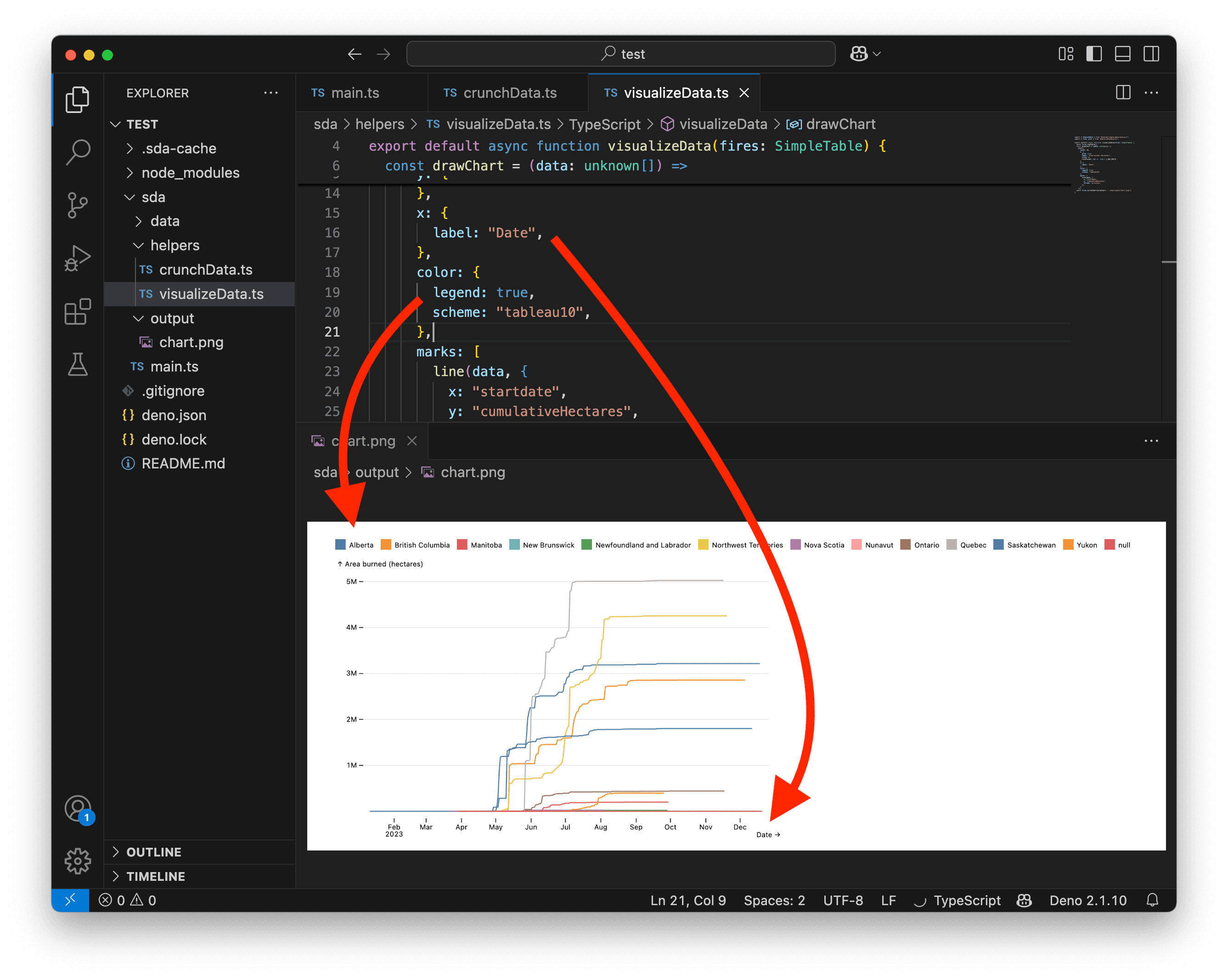
Hmmmm… The color legend doesn’t work very well with so many categories. We need to change our strategy. Instead of a color legend, maybe we could add a dot and a text label at the end of each line.
Let’s remove the color legend and add a dot mark. Since we want to add dots at the end of each line, we use the selectLast transform. This will select only the last data point.
Note that the order in the marks array is important. Marks are drawn in sequence, so if you want a shape to appear on top of another, add it later in the array.
import { SimpleTable } from "@nshiab/simple-data-analysis";
import { dot, line, plot, selectLast } from "@observablehq/plot";

export default async function visualizeData(fires: SimpleTable) {
  await fires.logTable();
  const drawChart = (data: unknown[]) =>
    plot({
      inset: 10,
      y: {
        grid: true,
        label: "Area burned (hectares)",
        ticks: 5,
        tickFormat: (d) => `${d / 1_000_000}M`,
      },
      x: {
        label: "Date",
      },
      color: {
        scheme: "tableau10",
      },
      marks: [
        line(data, {
          x: "startdate",
          y: "cumulativeHectares",
          stroke: "province",
        }),
        dot(
          data,
          selectLast({
            x: "startdate",
            y: "cumulativeHectares",
            fill: "province",
          }),
        ),
      ],
    });
  await fires.writeChart(drawChart, "./sda/output/chart.png");
}
And now let’s add the text labels. We use selectLast again with some additional options:
- In addition to
xandy, we also usezto let Plot know that we want a text label for each province. If we had usedfillorstrokewithprovincevalues, this would have been automatic, as the text would match the line colors. However, I prefer black text for labels. - We use the values in the
provincecolumn for thetext. - We apply a black
fillwith a whitestroketo improve readability, ensuring the text remains visible even when overlapping other chart elements. - We set
textAnchortostartso the text aligns with thedot, but we shift it by 5 pixels withdxto prevent it from touching the dot.
import { SimpleTable } from "@nshiab/simple-data-analysis";
import { dot, line, plot, selectLast, text } from "@observablehq/plot";

export default async function visualizeData(fires: SimpleTable) {
  await fires.logTable();
  const drawChart = (data: unknown[]) =>
    plot({
      inset: 10,
      y: {
        grid: true,
        label: "Area burned (hectares)",
        ticks: 5,
        tickFormat: (d) => `${d / 1_000_000}M`,
      },
      x: {
        label: "Date",
      },
      color: {
        scheme: "tableau10",
      },
      marks: [
        line(data, {
          x: "startdate",
          y: "cumulativeHectares",
          stroke: "province",
        }),
        dot(
          data,
          selectLast({
            x: "startdate",
            y: "cumulativeHectares",
            fill: "province",
          }),
        ),
        text(
          data,
          selectLast({
            x: "startdate",
            y: "cumulativeHectares",
            z: "province",
            text: "province",
            fill: "black",
            stroke: "white",
            textAnchor: "start",
            dx: 5,
          }),
        ),
      ],
    });
  await fires.writeChart(drawChart, "./sda/output/chart.png");
}
This is much better! But our chart needs some obvious adjustments now.
For example, we can see that the dots and labels at the end of the lines are not aligned… Since we summarized data based on the fires’ startDate, some provinces have gaps in their dates.
We also notice that not much is happening before mid-April and after October 1st.
Let’s go back to crunchData.ts to fix that:
- On line 10, we filter the fires to keep only those with a
startDatebetween April 15, 2023, and October 1st, 2023. - On lines 21-30, we retrieve the maximum
cumulativeHectaresfor each province and store the results in a new table,maxValuesPerProvince. Then, we remove and rename columns to match those in thefirestable. We also add a new column with the final date for our data (October 1st, 2023). Finally, we insert the rows from this new table into ourfirestable.
import { SimpleTable } from "@nshiab/simple-data-analysis";

export default async function crunchData(fires: SimpleTable) {
  await fires.cache(async () => {
    await fires.loadData(
      "https://raw.githubusercontent.com/nshiab/data-fetch-lesson/refs/heads/main/reported_fires_2023.csv",
    );
  });

  await fires.filter(`startdate >= '2023-04-15' && startdate <= '2023-10-01'`);
  await fires.summarize({
    values: "hectares",
    categories: ["province", "startdate"],
    summaries: "sum",
    decimals: 1,
  });
  await fires.accumulate("sum", "cumulativeHectares", {
    categories: "province",
  });
  await fires.round("cumulativeHectares", { decimals: 1 });
  const maxValuesPerProvince = await fires.summarize({
    values: "cumulativeHectares",
    categories: "province",
    summaries: "max",
    outputTable: "maxValuesPerProvince",
  });
  await maxValuesPerProvince.removeColumns("value");
  await maxValuesPerProvince.renameColumns({ max: "cumulativeHectares" });
  await maxValuesPerProvince.addColumn("startdate", "date", `'2023-10-01'`);
  await fires.insertTables(maxValuesPerProvince);
}
And now, our labels are properly aligned!
Let’s go back to visualizeData.ts to fix the right margin. We can also filter out some labels to prevent overlapping text.
import { SimpleTable } from "@nshiab/simple-data-analysis";
import { dot, line, plot, selectLast, text } from "@observablehq/plot";

export default async function visualizeData(fires: SimpleTable) {
  const drawChart = (data: unknown[]) =>
    plot({
      inset: 10,
      marginRight: 110,
      y: {
        grid: true,
        label: "Area burned (hectares)",
        ticks: 5,
        tickFormat: (d) => `${d / 1_000_000}M`,
      },
      x: {
        label: "Date",
      },
      color: {
        scheme: "tableau10",
      },
      marks: [
        line(data, {
          x: "startdate",
          y: "cumulativeHectares",
          stroke: "province",
        }),
        dot(
          data,
          selectLast({
            x: "startdate",
            y: "cumulativeHectares",
            fill: "province",
          }),
        ),
        text(
          data,
          selectLast({
            x: "startdate",
            y: "cumulativeHectares",
            z: "province",
            text: "province",
            fill: "black",
            stroke: "white",
            textAnchor: "start",
            dx: 5,
            filter: (d) => d.cumulativeHectares >= 400_000,
          }),
        ),
      ],
    });
  await fires.writeChart(drawChart, "./sda/output/chart.png");
}
And here’s our chart! Pretty nice, isn’t it? 😊

Of course, there’s much more you can do with Plot. Be sure to check the documentation and the examples.
And if you want to create charts that can be modified in software like Illustrator, just save them as .svg instead of .png.
Wildfires beeswarm chart
Our previous chart was quite traditional, but you can also create more unconventional visualizations that push the boundaries of data storytelling.
For example, let’s create a beeswarm of our fires.
We can update crunchData.ts to return to our raw data. However, let’s keep only fires greater than 1 hectare. That leaves us with around 2,400 fires. This is quite a lot, considering we want to visualize each fire individually!
import { SimpleTable } from "@nshiab/simple-data-analysis";

export default async function crunchData(fires: SimpleTable) {
  await fires.cache(async () => {
    await fires.loadData(
      "https://raw.githubusercontent.com/nshiab/data-fetch-lesson/refs/heads/main/reported_fires_2023.csv",
    );
  });
  await fires.filter(`hectares > 1`);
}
And let’s start by drawing our fires as simple dots on a y-axis.
import { SimpleTable } from "@nshiab/simple-data-analysis";
import { dot, plot } from "@observablehq/plot";

export default async function visualizeData(fires: SimpleTable) {
  await fires.logTable();
  const drawChart = (data: unknown[]) =>
    plot({
      marks: [
        dot(data, { y: "hectares" }),
      ],
    });
  await fires.writeChart(drawChart, "./sda/output/chart.png");
}
Right now, our fires are overlapping. The purpose of a beeswarm chart is to stack data points in a way that ensures each one remains visible.
To create a beeswarm, we can use the dodge transform with the middle option. Let’s update our code.
Rendering this chart may take a few seconds, depending on your machine’s processing power.
import { SimpleTable } from "@nshiab/simple-data-analysis";
import { dodgeX, dot, plot } from "@observablehq/plot";

export default async function visualizeData(fires: SimpleTable) {
  await fires.logTable();
  const drawChart = (data: unknown[]) =>
    plot({
      marks: [
        dot(data, dodgeX("middle", { y: "hectares" })),
      ],
    });
  await fires.writeChart(drawChart, "./sda/output/chart.png");
}
It looks like we have a looooot of small wildfires and a few very big ones.
A logarithmic scale could help with that! Let’s change our y scale type to log.
import { SimpleTable } from "@nshiab/simple-data-analysis";
import { dodgeX, dot, plot } from "@observablehq/plot";

export default async function visualizeData(fires: SimpleTable) {
  await fires.logTable();
  const drawChart = (data: unknown[]) =>
    plot({
      y: {
        type: "log",
      },
      marks: [
        dot(data, dodgeX("middle", { y: "hectares" })),
      ],
    });
  await fires.writeChart(drawChart, "./sda/output/chart.png");
}
This is already much better. Another improvement would be to scale the dot radius based on fire size.
We can update the options for the dot function and adjust the r scale to ensure a minimum radius of 1 pixel and a maximum of 20 pixels.
import { SimpleTable } from "@nshiab/simple-data-analysis";
import { dodgeX, dot, plot } from "@observablehq/plot";

export default async function visualizeData(fires: SimpleTable) {
  await fires.logTable();
  const drawChart = (data: unknown[]) =>
    plot({
      y: {
        type: "log",
      },
      r: {
        range: [1, 20],
      },
      marks: [
        dot(data, dodgeX("middle", { y: "hectares", r: "hectares" })),
      ],
    });
  await fires.writeChart(drawChart, "./sda/output/chart.png");
}
We are getting there.
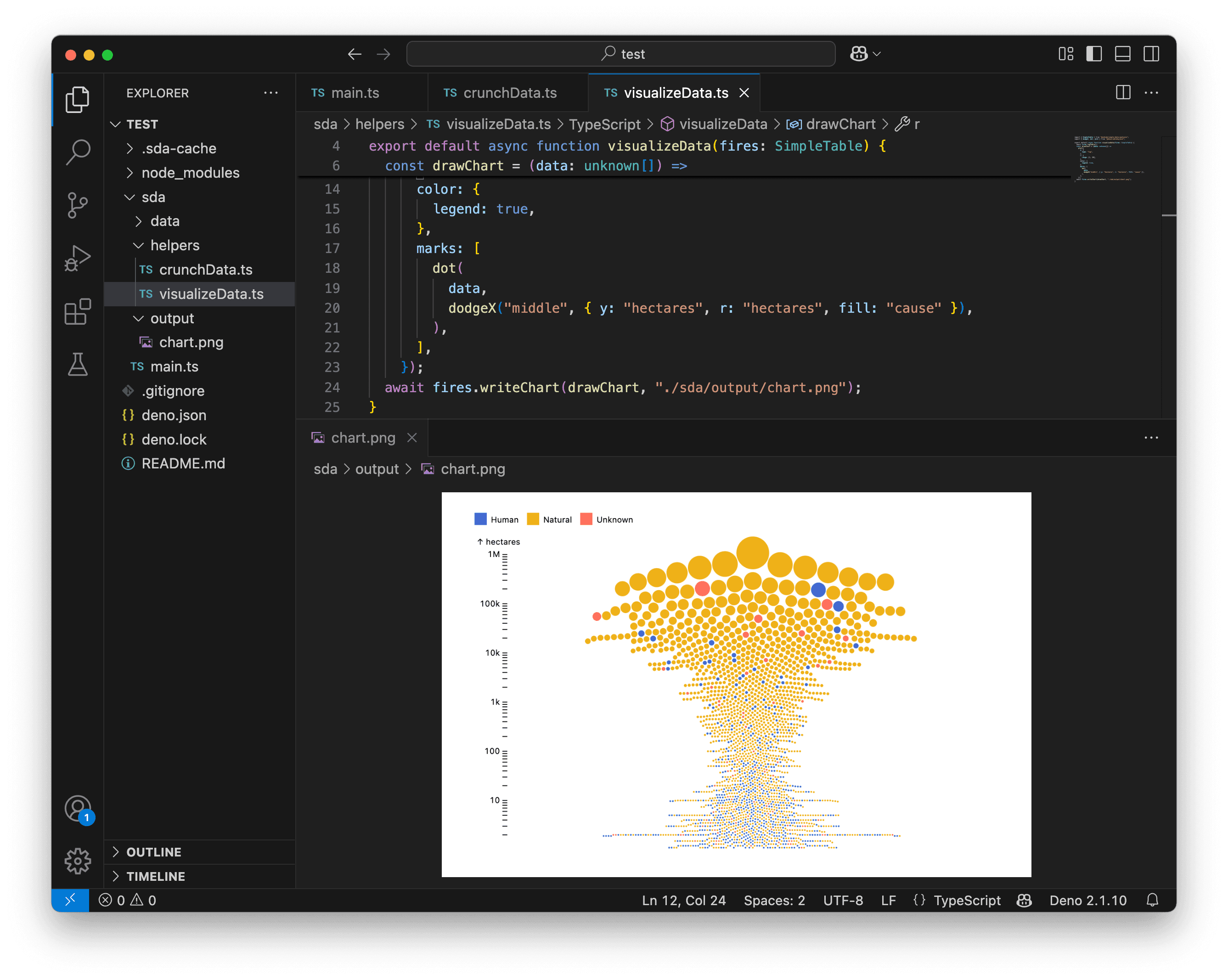
Let’s fill the circles based on the cause of the fire and add a legend.
import { SimpleTable } from "@nshiab/simple-data-analysis";
import { dodgeX, dot, plot } from "@observablehq/plot";

export default async function visualizeData(fires: SimpleTable) {
  await fires.logTable();
  const drawChart = (data: unknown[]) =>
    plot({
      y: {
        type: "log",
      },
      r: {
        range: [1, 20],
      },
      color: {
        legend: true,
      },
      marks: [
        dot(
          data,
          dodgeX("middle", { y: "hectares", r: "hectares", fill: "cause" }),
        ),
      ],
    });
  await fires.writeChart(drawChart, "./sda/output/chart.png");
}
To help compare the causes, we could use facets. Let’s do that to create three small charts instead of one large one.
To achieve this, we use the fx option to create horizontal facets. Let’s also increase the chart width for better readability.
import { SimpleTable } from "@nshiab/simple-data-analysis";
import { dodgeX, dot, plot } from "@observablehq/plot";

export default async function visualizeData(fires: SimpleTable) {
  await fires.logTable();
  const drawChart = (data: unknown[]) =>
    plot({
      width: 800,
      y: {
        type: "log",
      },
      r: {
        range: [1, 20],
      },
      color: {
        legend: true,
      },
      marks: [
        dot(
          data,
          dodgeX("middle", {
            y: "hectares",
            r: "hectares",
            fill: "cause",
            fx: "cause",
          }),
        ),
      ],
    });
  await fires.writeChart(drawChart, "./sda/output/chart.png");
}
This is starting to look very good. We probably don’t need the color legend anymore.
Let’s tweak the labels and axes, then call it a day!
import { SimpleTable } from "@nshiab/simple-data-analysis";
import { dodgeX, dot, plot } from "@observablehq/plot";

export default async function visualizeData(fires: SimpleTable) {
  await fires.logTable();
  const drawChart = (data: unknown[]) =>
    plot({
      width: 800,
      marginTop: 40,
      y: {
        type: "log",
        label: "Hectares",
        ticks: 5,
        grid: true,
      },
      r: {
        range: [1, 20],
      },
      fx: {
        label: null,
      },
      marks: [
        dot(
          data,
          dodgeX("middle", {
            y: "hectares",
            r: "hectares",
            fill: "cause",
            fx: "cause",
          }),
        ),
      ],
    });
  await fires.writeChart(drawChart, "./sda/output/chart.png");
}
This is quite nice, isn’t it? By playing with marks and transforms, you can create stunning data visualizations with SDA and Plot.
Again, I encourage you to check the Plot documentation and examples. You’ll have a lot of fun with this library! 💃🕺

Fires map
With SDA, you can work with both tabular and geospatial data. When wrangling geospatial data, you often want to create maps!
Let’s map our fires along with the Canadian province boundaries.
First, we need to store the fire geometries in the same table as the province boundaries.
Let’s reuse what we did in the previous lesson and update crunchData.ts. We’ll modify it to take a second table, provinces, as a parameter. We fetch and cache the province boundaries, then insert them into the fires table. Before inserting, we add a column isFire to the fires table to easily differentiate them later.
import { SimpleTable } from "@nshiab/simple-data-analysis";

export default async function crunchData(
  fires: SimpleTable,
  provinces: SimpleTable,
) {
  await fires.cache(async () => {
    await fires.loadData(
      "https://raw.githubusercontent.com/nshiab/data-fetch-lesson/refs/heads/main/reported_fires_2023.csv",
    );
    await fires.points("lat", "lon", "geom");
    await fires.addColumn("isFire", "boolean", `TRUE`);
  });

  await provinces.cache(async () => {
    await provinces.loadGeoData(
      "https://raw.githubusercontent.com/nshiab/simple-data-analysis/main/test/geodata/files/CanadianProvincesAndTerritories.json",
    );
  });

  await fires.insertTables(provinces, { unifyColumns: true });
}
Let’s remove everything except the logTable in visualizeData.ts for now.
import { SimpleTable } from "@nshiab/simple-data-analysis";

export default async function visualizeData(fires: SimpleTable) {
  await fires.logTable();
}
And let’s update main.ts to create a new table provinces and pass it to crunchData.
import { SimpleDB } from "@nshiab/simple-data-analysis";
import crunchData from "./helpers/crunchData.ts";
import visualizeData from "./helpers/visualizeData.ts";

const sdb = new SimpleDB();
const fires = sdb.newTable("fires");
const provinces = sdb.newTable("provinces");

await crunchData(fires, provinces);
await visualizeData(fires);

await sdb.done();
Here’s what you should see to start on the right foot.

Now, let’s work on our map in visualizeData. Instead of using writeChart, we must use writeMap.
Since we are working with geospatial data, writeMap passes the data as GeoJSON to the drawing function. This is why drawMap expects data with the type { features: { properties: { [key: string]: unknown } }[] }. Essentially, this means that our table data is now stored in each feature’s properties.
To easily work with the fires and the provinces, we first isolate them on lines 9-14. Then, in the plot function, we use the geo mark, which handles the geospatial coordinates of the features.
import { SimpleTable } from "@nshiab/simple-data-analysis";
import { geo, plot } from "@observablehq/plot";

export default async function visualizeData(fires: SimpleTable) {
  await fires.logTable();
  const drawMap = (
    data: { features: { properties: { [key: string]: unknown } }[] },
  ) => {
    const firesPoints = data.features.filter(
      (feature) => feature.properties.isFire,
    );
    const provincesPolygons = data.features.filter(
      (feature) => !feature.properties.isFire,
    );

    return plot({
      marks: [
        geo(provincesPolygons),
        geo(firesPoints),
      ],
    });
  };
  await fires.writeMap(drawMap, "./sda/output/map.png");
}
As you can see in the screenshot above, the geo mark automatically detected the point coordinates of our fires and the polygon coordinates of the Canadian province boundaries. Pretty clever! 🤓
Right now, the projection is Mercator. Fortunately, Plot supports better projections. Let’s update the projection option:
- Set the
typetoconic-conformal. - Use the
rotateoption to ensure the map isn’t tilted with this projection. - Use the
domainoption to help Plot make our geospatial data take up as much space as possible on the map.
import { SimpleTable } from "@nshiab/simple-data-analysis";
import { geo, plot } from "@observablehq/plot";

export default async function visualizeData(fires: SimpleTable) {
  await fires.logTable();
  const drawMap = (
    data: { features: { properties: { [key: string]: unknown } }[] },
  ) => {
    const firesPoints = data.features.filter(
      (feature) => feature.properties.isFire,
    );
    const provincesPolygons = data.features.filter(
      (feature) => !feature.properties.isFire,
    );

    return plot({
      projection: {
        type: "conic-conformal",
        rotate: [100, -60],
        domain: data,
      },
      marks: [
        geo(provincesPolygons),
        geo(firesPoints),
      ],
    });
  };
  await fires.writeMap(drawMap, "./sda/output/map.png");
}
This is looking better. Let’s style our province boundaries to create a nice light background.
import { SimpleTable } from "@nshiab/simple-data-analysis";
import { geo, plot } from "@observablehq/plot";

export default async function visualizeData(fires: SimpleTable) {
  await fires.logTable();
  const drawMap = (
    data: { features: { properties: { [key: string]: unknown } }[] },
  ) => {
    const firesPoints = data.features.filter(
      (feature) => feature.properties.isFire,
    );
    const provincesPolygons = data.features.filter(
      (feature) => !feature.properties.isFire,
    );

    return plot({
      projection: {
        type: "conic-conformal",
        rotate: [100, -60],
        domain: data,
      },
      marks: [
        geo(provincesPolygons, {
          stroke: "lightgray",
          fill: "whitesmoke",
        }),
        geo(firesPoints),
      ],
    });
  };
  await fires.writeMap(drawMap, "./sda/output/map.png");
}
Now, let’s work on the fires. Since they are point geometries, Plot automatically represents them as dots using the geo mark.
But nothing stops us from using another mark! Let’s create a spike map instead.
Because the fires are a collection of GeoJSON features, we need to use arrow functions to specify where Plot should find the right values for the spike options.
import { SimpleTable } from "@nshiab/simple-data-analysis";
import { geo, plot, spike } from "@observablehq/plot";

export default async function visualizeData(fires: SimpleTable) {
  await fires.logTable();
  const drawMap = (
    data: { features: { properties: { [key: string]: unknown } }[] },
  ) => {
    const firesPoints = data.features.filter(
      (feature) => feature.properties.isFire,
    );
    const provincesPolygons = data.features.filter(
      (feature) => !feature.properties.isFire,
    );

    return plot({
      projection: {
        type: "conic-conformal",
        rotate: [100, -60],
        domain: data,
      },
      length: {
        range: [1, 100],
      },
      marks: [
        geo(provincesPolygons, {
          stroke: "lightgray",
          fill: "whitesmoke",
        }),
        spike(firesPoints, {
          x: (d) => d.properties.lon,
          y: (d) => d.properties.lat,
          length: (d) => d.properties.hectares,
        }),
      ],
    });
  };
  await fires.writeMap(drawMap, "./sda/output/map.png");
}
This is quite interesting! Now, let’s color-code the spikes based on the cause of the wildfires.
import { SimpleTable } from "@nshiab/simple-data-analysis";
import { geo, plot, spike } from "@observablehq/plot";

export default async function visualizeData(fires: SimpleTable) {
  await fires.logTable();
  const drawMap = (
    data: { features: { properties: { [key: string]: unknown } }[] },
  ) => {
    const firesPoints = data.features.filter(
      (feature) => feature.properties.isFire,
    );
    const provincesPolygons = data.features.filter(
      (feature) => !feature.properties.isFire,
    );

    return plot({
      projection: {
        type: "conic-conformal",
        rotate: [100, -60],
        domain: data,
      },
      length: {
        range: [1, 100],
      },
      color: {
        legend: true,
      },
      marks: [
        geo(provincesPolygons, {
          stroke: "lightgray",
          fill: "whitesmoke",
        }),
        spike(firesPoints, {
          x: (d) => d.properties.lon,
          y: (d) => d.properties.lat,
          length: (d) => d.properties.hectares,
          stroke: (d) => d.properties.cause,
        }),
      ],
    });
  };
  await fires.writeMap(drawMap, "./sda/output/map.png");
}
We have a lot of overlapping spikes. By default, Plot draws the spikes in the order they appear in the data. Let’s change that to create a nice 3D effect.
Let’s update crunchData to sort the fires in descending order by their latitude (lat) values. This way, the fires with a greater latitude (further north) will be drawn first and will be overlapped by the ones with a smaller latitude (further south). This approach adds some perspective to the map.
Thank you to Philippe Rivière for the suggestion! 😊
import { SimpleTable } from "@nshiab/simple-data-analysis";

export default async function crunchData(
  fires: SimpleTable,
  provinces: SimpleTable,
) {
  await fires.cache(async () => {
    await fires.loadData(
      "https://raw.githubusercontent.com/nshiab/data-fetch-lesson/refs/heads/main/reported_fires_2023.csv",
    );
    await fires.points("lat", "lon", "geom");
    await fires.addColumn("isFire", "boolean", `TRUE`);
    await fires.sort({ lat: "desc" });
  });

  await provinces.cache(async () => {
    await provinces.loadGeoData(
      "https://raw.githubusercontent.com/nshiab/simple-data-analysis/main/test/geodata/files/CanadianProvincesAndTerritories.json",
    );
  });

  await fires.insertTables(provinces, { unifyColumns: true });
}
Also, by default, Plot assigns an opacity of 0.3 to the fill color of the spikes. Instead, we can use paler colors that match the color legend. Removing the transparency will help reduce visual confusion on the map.
Additionally, we can increase the maximum spike height for better visibility.
import { SimpleTable } from "@nshiab/simple-data-analysis";
import { geo, plot, spike } from "@observablehq/plot";

export default async function visualizeData(fires: SimpleTable) {
  await fires.logTable();
  const drawMap = (
    data: { features: { properties: { [key: string]: unknown } }[] },
  ) => {
    const firesPoints = data.features.filter(
      (feature) => feature.properties.isFire,
    );
    const provincesPolygons = data.features.filter(
      (feature) => !feature.properties.isFire,
    );

    return plot({
      projection: {
        type: "conic-conformal",
        rotate: [100, -60],
        domain: data,
      },
      length: {
        range: [1, 200],
      },
      color: {
        legend: true,
      },
      marks: [
        geo(provincesPolygons, {
          stroke: "lightgray",
          fill: "whitesmoke",
        }),
        spike(firesPoints, {
          x: (d) => d.properties.lon,
          y: (d) => d.properties.lat,
          length: (d) => d.properties.hectares,
          stroke: (d) => d.properties.cause,
          fillOpacity: 1,
          fill: (d) => {
            if (d.properties.cause === "Human") {
              return "#b5caff";
            } else if (d.properties.cause === "Natural") {
              return "#ffe6a8";
            } else {
              return "#ffb9ad";
            }
          },
        }),
      ],
    });
  };
  await fires.writeMap(drawMap, "./sda/output/map.png");
}There are many ways to represent colors. Here, I am using HEX color values. Read this if you want to know more.
This is looking great! To learn more about maps, check out the geo mark documentation as well as the projection documentation.

Conclusion
Congrats! You now know how to create data visualizations with SDA and Plot!
I hope the step-by-step examples helped you understand how to build everything from simple charts to more innovative ones using both tabular and geospatial data.
Of course, these visualizations are static. There’s no user interaction and no animations since they are saved as images.
But don’t worry! We’ll reuse everything we’ve learned here to create interactive and animated data visualizations on the web in a future lesson! 😁
See you soon!